CMYK – a four colour palette with a wide spectrum
Firstly let’s get the CMYK acronym out into the open – it stands for Cyan, Magenta, Yellow and Black. Yes, I know ‘black’ is with a ‘B’ so why not CMYB? Well, ‘B’ is already used for ‘Blue’ in RGB, so it would be confusing. The ‘K’ apparently stands for Key (or perhaps its just the last letter of black… who knows). CMYK is the standard in the printing industry, and pretty much most of what you see these days, by way of printed media, is CMYK. Anyone who’s ever owned a colour inkjet printer is sure to recall buying ink cartridges in those four colours, with which you could print almost anything – even full-colour photographs.
Some technical stuff
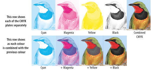
The basic theory behind printing is the use of each of these colours (applied in phases), with different patterns or screens of tiny dots which are small enough that the human eye perceives a solid colour. Varying the density of the dots as each colour is overlayed can create a whole spectrum of colours, which in turn creates an image. This is a whole theory all of its own and, if you want to know more, there are numerous sources of information as well as colour charts on the web.
A simple palette
My world for the past 20 years has been immersed in the graphic design industry, where, of course, printing is a huge role player – so it goes without saying that for me CMYK is very second nature – it’s primarily how my brain mixes colours. Now finding myself getting back into the art world, what I’m seeing is that, in most basic colour sets, you are presented with two variants of each primary (being a warm and cool version); blue, red, and yellow, along with black and white (so 8 colours). I have found that these have such limitations when mixing that it is virtually impossible to create a nice spectrum of colours. For instance, we learn that red and blue creates purple – but when mixing using my standard set, all I came up with was a dirty looking, dull purple, when what I was hoping for was a vibrant colour. I then found myself needing more colours and that got me thinking… surely CMYK could be the answer? Why has this basic palette not migrated over into painting more than what it appears to have done?
I love trying new art supplies (as I’m sure many others do) and it can get quite costly to buy a decent range of colours in every new medium you want to try out. I have also come to realize that good quality products make a big difference, so I try to use artist quality products as far as possible, but those come with a higher price tag. So imagine only needing to buy 4 colours each time a new medium tickles your fancy (5 if you add white) – at least until you decide if its a medium you actually want to invest more time and money into. Most of the better quality product ranges allow you to purchase individual colours, and most of those have options close enough to CMYK to be able to use this theory.
Inking for Inktober
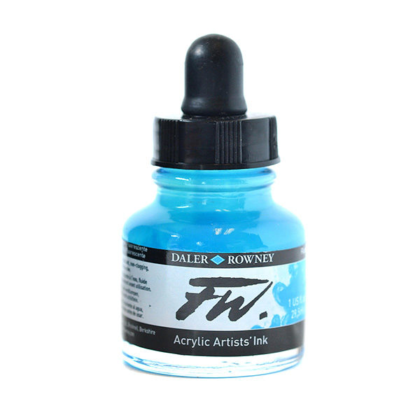
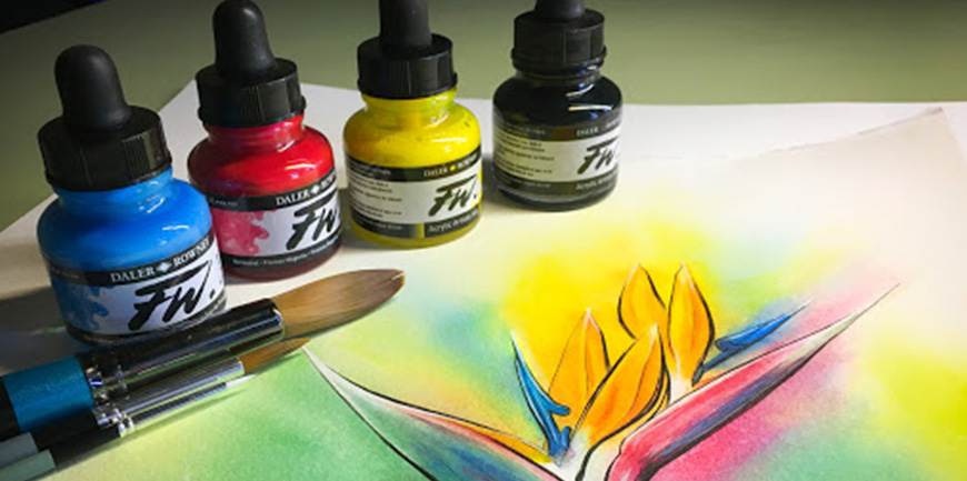
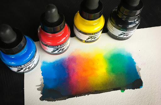
So, in the spirit of Inktober, I decided to try some Daler Rowney FW Acrylic Artists’ Inks. I have been wanting to try these inks for a while, but each time I face myself with the colour chart, I can’t decide which colours to start with. These inks sport some beautiful, vibrant colours, in a range of 38, that are water-resistant and have a high degree of lightfastness. They actually have process cyan, process magenta, process yellow and of course, black, so I thought it would be a good opportunity to demonstrate the CMYK colour mixing concept. Being a watercolourist, my approach was more to use them diluted with water, in a similar way to what watercolour paints are used. These inks, however, can be used in a variety of different ways and on virtually all surfaces, so the sky really is the limit with them. They even work well through airbrushes and technical pens.
Looking at the colour chart one will notice that some of the colours are transparent and some opaque. This threw my colour mixing theory ever so slightly as I found the magenta and yellow to be transparent, whereas the black and cyan, opaque. I did notice with the cyan that it had almost a white base, that became apparent when mixing, which did not drastically affect things, but should be kept in mind when overlaying colours.
Chasing rainbows
The colours mixed just as planned and I got a lovely rainbow of vibrant colours – no more dirty purples! Although CMYK does still have its limitations and challenges, you really are able to get just about any colour you can think of. I have to admit that it’s far more of a challenge to actually mix the colours in inks than it is to just drag the sliders in a graphic design program and it certainly will take some practice to perfect mixing just the right hue. Of course, you can always try glazing one colour over the other to achieve the desired effect which should work with most mediums. Earth tones can certainly be more of a challenge to mix using CMYK.
So I guess, what it comes down to is, if you are wanting to use very few colours for reasons of, perhaps, expense, or just testing a new medium, then CMYK is certainly a good way to start. It definitely is a great way to reach the widest spectrum with the use of only four colours – which is certainly better, I feel than the traditional red, blue and yellow found in most basic colour sets. It will, however, never curb our needs as artists to add more colours into our collection, as mixing colours can certainly become a tedious task and it is far more convenient and fun to have a wide range of colours at our disposal. There are so many different pigments out there used to make paints that it can really be a joy to experiment with them.
In the end, we are all (whether we like to admit it or not), art supply junkies and will always need another colour – and that is all part of the fun and love of art!
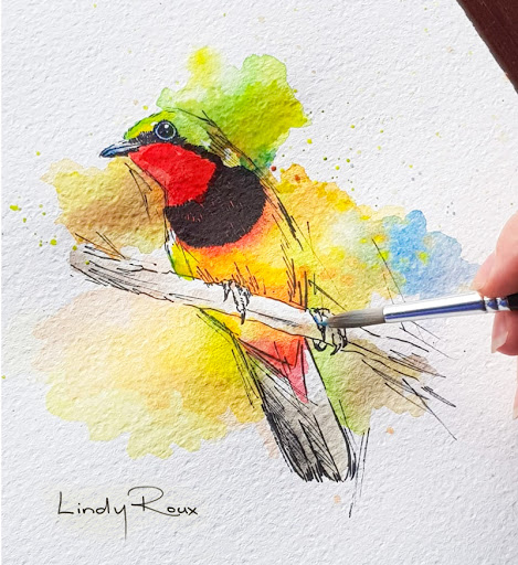
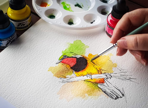
Additional artwork (Gorgeous Bush-Shrike) for this post created with Daler Rowney FW Acrylic Artists’ Inks – by Lindy Roux.