Description
Founded in Nara in 1902, Kuretake has spent over a century exploring the beauty and potential of ink. Rooted in the tradition of handcrafted Nara sumi, the company continues to blend heritage with innovation—reimagining how people experience writing and art.
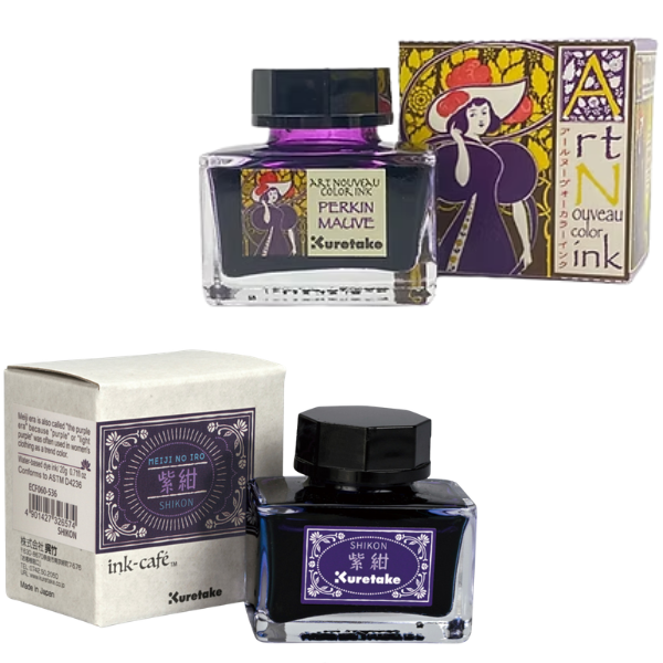
This spirit lives on in the Art Nouveau Colour Ink series. Inspired by the elegance and flowing forms of the Art Nouveau movement, these inks celebrate expressive line work and luminous colour while benefiting from Kuretake’s advanced micro-particle dispersion technology. The result is smooth, consistent flow and richly layered tones that enhance both calligraphy and illustration.
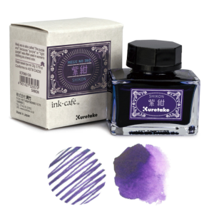
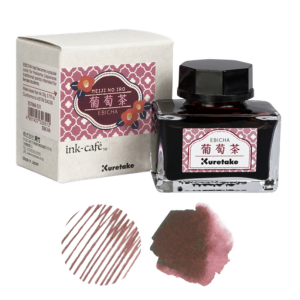
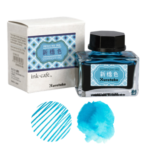
The MEIJI NO IRO series is a refined collection of coloured inks inspired by shades cherished during Japan’s Meiji era (1868–1912). Each colour reflects the spirit and aesthetic of this transformative period, carrying with it a story rooted in history. As you write or draw, let these inks evoke the atmosphere and elegance of old Japan.
Art Nouveau Colour Ink Series includes the following six colours:
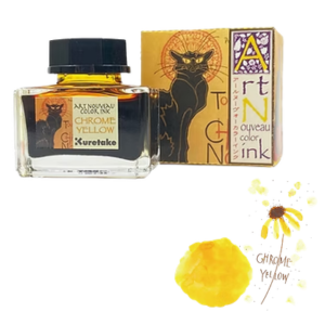
- Chrome yellow: A radiant reddish-yellow that embodies the essence of Art Nouveau, its bottle pays homage to the touring poster for the Parisian cabaret Le Chat Noir (The Black Cat), painted by Theophile Alexandre Steinlen.
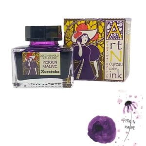
- Perkin mauve: Queen Victoria’s dress at the Paris World’s Fair made Mauve hugely popular in the era of Art Nouveau. Many Art Nouveau posters depict women in mauve dresses. Developed by William Perkin, this color was the world’s first chemical dye.
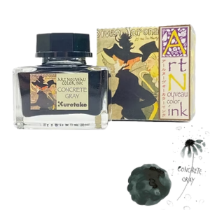
- Concrete grey: Sturdy concrete foundations revolutionized entertainment venues, shaping the nightlife and bustling streets of Paris. This gray ink enhances the other Art Nouveau colours as seen in the music cafe poster, Divan Japonais (Japanese Lounge) painted by Henri de Toulouse-Lautrec.
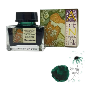
- Zsolnay green: The Hungarian glazes at the Zsolnay porcelain factory made this mesmerizing green famous during the Paris Expo. This ink draws inspiration from those brilliant glazes and matches many Art Nouveau motifs featuring nature. As seen in the work L’Ermitage painted by Paul Berthon.
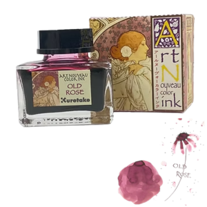
- Old rose: This muted pink evokes the ethereal allure of Victorian charm. The box office poster, The Lady of the Camellias by A[phonse Mucha, inspires the colour of this Old rose ink. A single camellia adorns the heroine’s hair, a poignant symbol of a love destined for tragedy, gradually fading away like the delicate petals of a wilting flower.
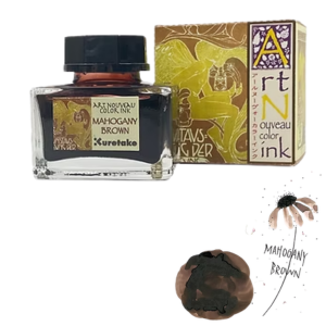
- Mahogany brown: The rich, reddish-brown tones of Mahogany reflect the natural palette so closely associated with the Art Nouveau aesthetic. The bottle design pays tribute to the 5th Art Exhibition of the Vienna Secession, featuring artwork by Koloman Moser. It depicts a long-haired figure with butterfly wings poised upon a flower—an elegant composition defined by flowing lines and organic curves that embody the spirit of Art Nouveau.
MEIJI NO IRO Ink Series includes the following six colours:
- EBICHAK: During the Meiji era, purple was regarded as a noble colour reserved for the aristocracy. As a result, many people hesitated to wear it, and instead chose “EBICHA,” a rich reddish-brown tone that offered a more approachable alternative. EBICHA became especially popular for women’s hakama—traditional Japanese garments worn by female students—giving the colour a lasting cultural association with education and refinement.
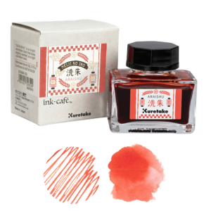
- ARAISHU: In the latter half of the Meiji era, there was a renewed appreciation for Japanese culture and the revival of traditional Japanese colours. One such shade is “Araishu.” Araishu is a bright vermilion with a softly muted quality—a gently washed, light vermilion tone that reflects both vibrancy and subtle elegance.
- SHIMBASHI-IRO: In the late Meiji era, the development of chemical dyes gave rise to a new wave of vibrant colours. One of these shades is “Shimbashi,” named after an area in Tokyo. This bright bluish-green hue became especially popular among geisha in Shimbashi, admired for its fashionable and modern appeal.
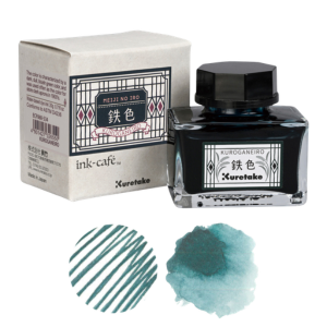
- KUROGANEIRO: “KUROGANEIRO” rose to popularity from the mid-Meiji era through the Taisho era. This shade is defined by its dark, muted bluish-green tone. Practical and understated, it was commonly used for shop clerks’ aprons, becoming closely associated with everyday workwear of the time.
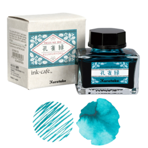
- KUJAKURYOKU: “KUJAKURYOKU” was introduced to Japan from the West during the Meiji era. It is a vivid bluish-green, reminiscent of the striking feathers of a peacock. Peacocks have long been admired in Japan, and their popularity among the general public grew notably during the Edo period, symbolizing beauty and elegance.
- SHIKON: The Meiji era is sometimes called “the Purple Era,” as purple and light purple were popular choices in women’s clothing, seen as chic and sophisticated. Since then, purple has remained a fashionable and enduring colour in Japan.


Reviews
There are no reviews yet.