Description
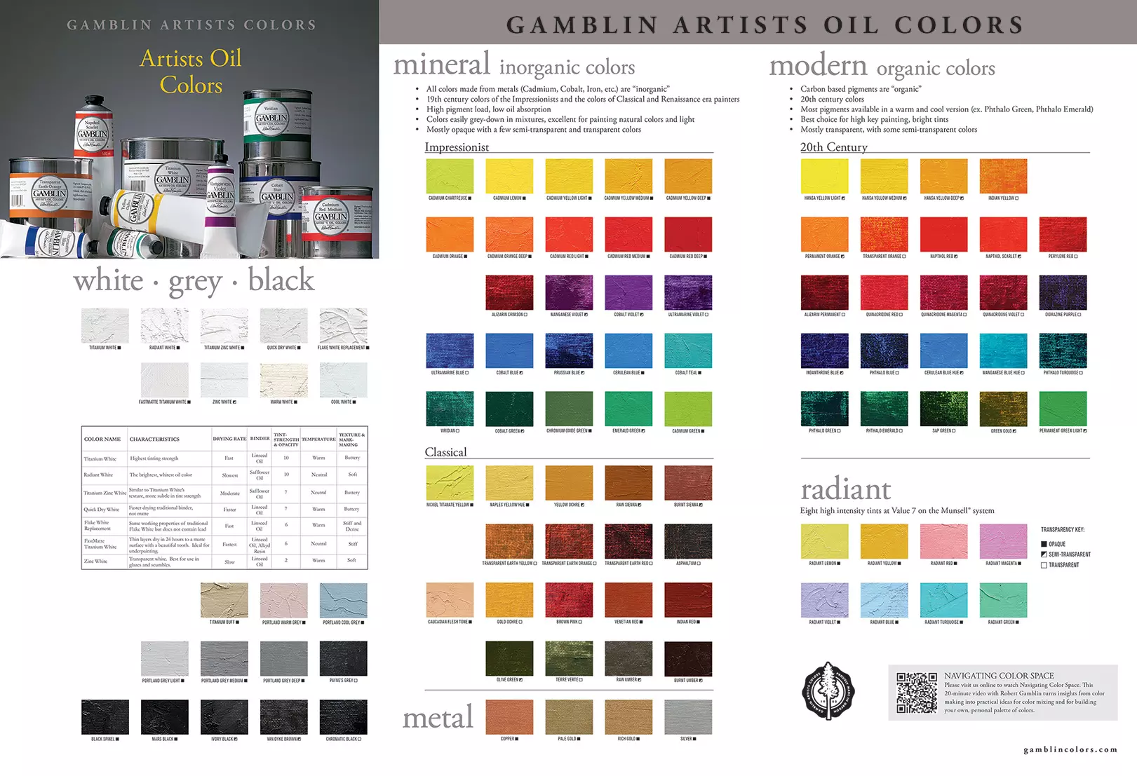
Gamblin’s Colour Chart is Organized by ‘Mineral’ and ‘Modern’
This visual division of mineral and modern colours is unique in the art material industry, and it gives painters an insight into the makeup of pigments from which these colours are derived, as well as some practical information to help painters create their own personal colour palettes.
The Mineral side of the colour chart includes those colours made from inorganic pigments from earth and metals. These include earth colours such as Burnt Sienna and Yellow Ochre, as well as those metal-based colours such as Cadmium Yellows and Reds and Cobalt Blue, Green, and Violet.
The Modern side of the colour chart is comprised of colours made from modern “organic” pigments, which have a molecular structure based on carbon. These include the “tongue-twisting” colour names like Quinacridone, Phthalocyanine, and Dioxazine.
These two groups of colours have unique mixing characteristics, so this organization helps painters choose an appropriate palette for their artistic intentions.
Click here to download Gamblin’s Artist’s Grade Color Chart.
Pigment History
As we look back throughout the history of art, paintings have always been a reflection of the materials that were available to artists. This organization of the Gamblin chart can be broken down a bit further by giving it some historical perspective based on the three main eras of pigment history
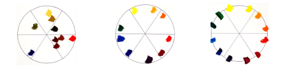
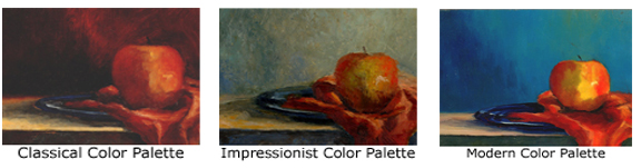
The Classical Palette: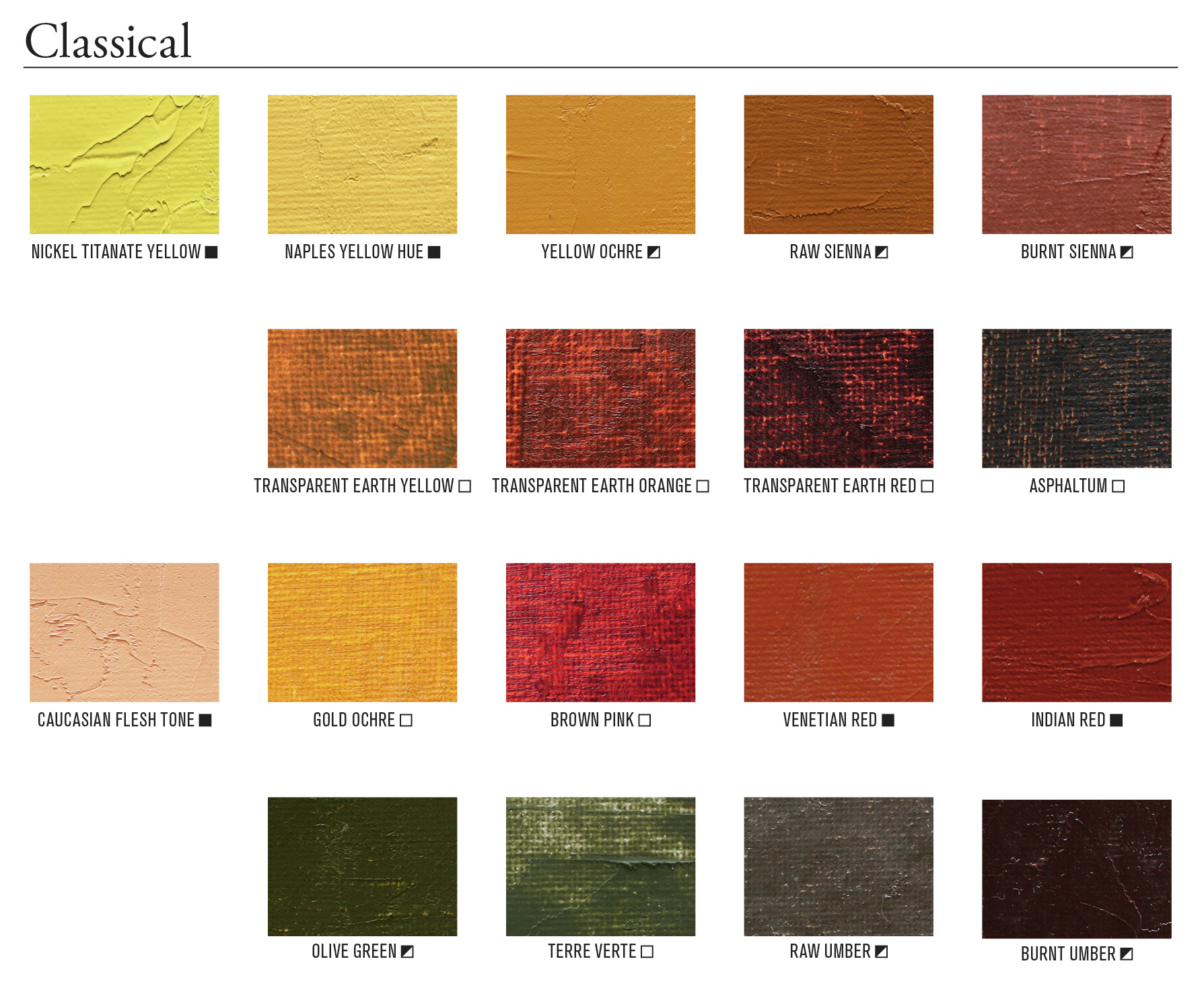
The Classical Palette: From Dark to Light
At the bottom of the Mineral side of the colour chart is the group of earth colours that make up the heart of painters palettes during the Classical era of pigment history. This group of pigments, which has its origins in cave painting and antiquity, was central to the oil painter’s palette from the Renaissance through the Classical Era of oil painting up until the first half of the Nineteenth Century.
Classical Palette Colours:
Naples Yellow, Yellow Ochre, Raw Umber, Vermillion, Raw Umber, Vermillion, Venetian Red, Burnt Sienna, Indian Red, Ultramarine Blue (lapis,)Terre Verte.
This limited range of muted earth colours exists close to the “neutral core” of Colour Space.
Limited to this range of the colour spectrum, painters depicted form by drawing large contrasts between the darkest darks and the lightest lights, creating the chiaroscuro (literally, “light/dark”) effect so characteristic of classical paintings.
The Impressionist Palette: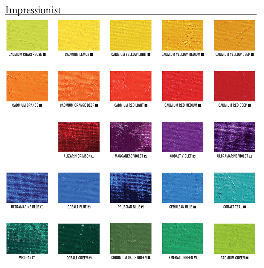
The Impressionist Palette: A Perfect Storm and a Sea of Change in Colour.
The advancements of the Industrial Revolution of the mid-nineteenth century widened the spectrum of both colour and possibilities for artists. From nineteenth-century onward, pigments were no longer made specifically for artists’ use but for larger industrial coatings and printing industries. A new range of pigments were made by fusing inorganic materials, such as cadmium, cobalt, and chromium, together at very high heat. Not only did these colours brighten the urban centres of the Iron Age, but they widened painters’ access to colour compared to the palettes of the Classical Era. Other inventions of the nineteenth century such as the three-roll mill and the collapsible metal paint tube gave painters the freedom to leave the confines of their studios and paint directly from nature. At the same time, photography was threatening painting’s role of reporting the visual world, and painters were revolting against the tonal traditionalists of the Parisian art academies. These factors culminated into a “perfect storm,” and the result is the oeuvre from the Impressionist movement.
For the first time in history, painters of this period had the pigments available to capture all of the colours of the natural world, expressed in the Impressionists’ interest in pure colour. The denser, tubed oil colours made from brighter and opaque pigments lent themselves to the direct painting techniques so characteristic of the Impressionists.
Impressionist Palette Colours:
Yellow Light, Cadmium Yellow Deep, Cadmium Orange, Cadmium Red Light, Alizarin Crimson, Cobalt Violet, Ultramarine Blue, Cerulean Blue, Viridian.
The Modern Palette: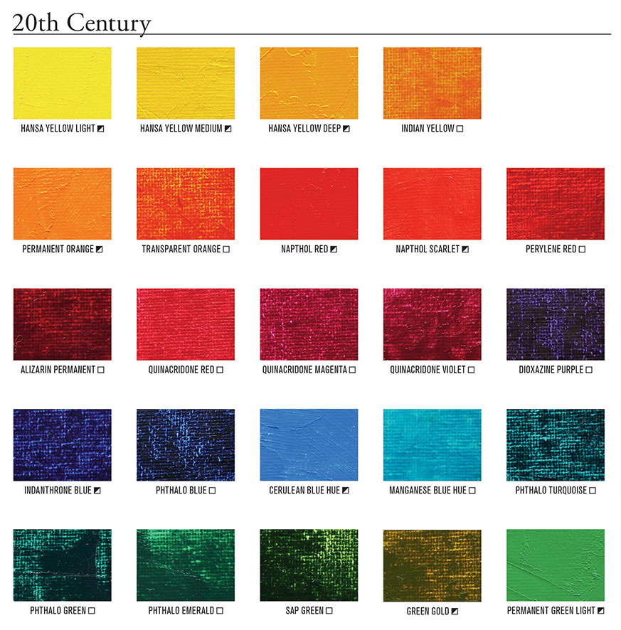 The Modern Palette: Another Colour Revolution.
The end of the nineteenth century gave birth to the field of organic chemistry with applications in the pharmaceutical, dye, and printing industries. Modern organic pigments are made in high-tech laboratories from materials which have central atoms of carbon. These colours are characterized by their greater transparency and their capacity to produce intense tints and mixtures. Colour makers not only matched nature’s abundance of colour but also improved upon it.
Once again, developments in pigment technology widened painters’ access to colour and expanded creative possibilities. Unlike pigment families on the mineral side of the colour chart, which shift in value from light to dark (i.e. Cadmium Lemon to Cadmium Yellow Deep), modern organic colours shift in temperature from cool to warm, such as Phthalo Green (cool) to Phthalo Emerald (warm). This temperature bias of modern colours is conducive to creating a Spectral Palette, which incorporates a warm and cool for each of the six hue families. Thus, the colours included in the Spectral Palette occupy the most space around the perimeter of the colours wheel, giving painters the greatest colour mixing potential within Colour Space.
Modern Palette Colors:
Hansa Yellow Light, Hansa Yellow Medium, Hansa Yellow Deep, Permanent Orange, Napthol Scarlet, Quinacridone Red, Quinacridone Violet, Dioxazine Purple, Phthalo Blue, Manganese Blue Hue, Phthalo Green, Phthalo Emerald.
The Difference Between Mineral and Modern Colours.
The biggest difference in the characteristics between mineral and modern colours–and arguably of most interest to painters–is how these two groups of pigments behave differently in colour mixing.
Mineral Cadmium Red Medium “greys down” and loses its intensity as it is mixed with white, compared to the modern Naphthol Red, which retains its intensity in its tint. This difference will hold up for any mineral vs. any modern colour. Mineral colours, in tints, shift in VALUE and CHROMA. Modern colours shift only in VALUE and retain their high CHROMA.
This difference will also hold up during colour-to-colour mixing:
Mineral colours are suitable for painters that are interested in capturing the colours of the natural world and the effects of natural light. Modern organic colors are appropriate for painters who want to make high key color mixtures. Modern colors are also more transparent, giving painters high key colors in all hue families for glazing or indirect painting techniques.
As we take a look at these three colour palettes representative of the three main eras of pigment history, we can easily see how advancements in pigment technology have widened painters’ access to colour.
Gamblin Mineral Colors:
Cadmium Chartreuse, Cadmium Lemon, Cadmium Yellow Light, Cadmium Yellow Medium, Cadmium Yellow Deep,Cadmium Orange, Cadmium Orange Deep, Cadmium Red Light, Cadmium Red Medium, Cadmium Red Deep, Alizarin Crimson, Manganese Violet, Cobalt Violet, Ultramarine Violet, Ultramarine Blue, Cobalt Blue, Prussian Blue, Cerulean Blue, Cobalt Teal, Viridian, Cobalt Green, Chromium Green Oxide, Emerald Green, Cadmium Green, Nickel Titanate Yellow, Naples Yellow, Yellow Ochre, Raw Sienna, Burnt Sienna, Transparent Earth Yellow, Transparent Earth Orange, Transparent Earth Red, Asphaltum, Naples Orange, Gold Ochre, Brown Pink, Venetian Red, India Red, Olive Green, Terre Verte, Raw Umber, Burnt Umber, Black Spinel, Mars Black, Ivory Black, Van Dyke Brown.
Gamblin Modern Colors:
Hansa Yellow Light, Hansa Yellow Medium, Hansa Yellow Deep, India Yellow, Permanent Orange, Transparent Orange, Napthol Red, Napthol Scarlet, Perylene Red, Alizarin Permanent, Quinacridone Red, Quinacridone Magenta, Quinacridone Violet, Dioxazine Purple, Indanthrone Blue, Phthalo Blue, Cerulean Blue Hue, Manganese Blue Hue, Phthalo Turquoise, Phthalo Green, Phthalo Emerald, Sap Green,Green Gold, Permanent Green Light, Chromatic Black.


Reviews
There are no reviews yet.