Have you ever walked past a painting or drawing that just seemed so lifelike that you felt like reaching out and touching the rich colour to see if the texture your eyes could see, would be there for your fingers to feel? There is always more to learn, but I would like to share some of my own experience with you today. While I specialise in animals and birds, this is also applicable to botanicals and portraits and many other subjects.
Get your proportions correct
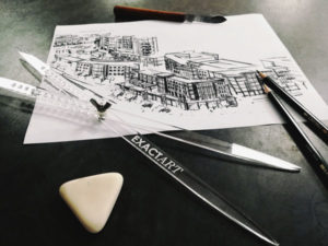
One of the key elements to achieving realism is to make sure that your subject’s eyes and ears aren’t only in the right place, but the correct size and that the proportion to your drawing is realistic. Here I will confess to using the grid method for my drawings, but you can also use a portion divider and some artists actually trace their reference to make sure everything is correct. While there are a myriad of opinions on this subject and how to achieve a realistic-to-life drawing, the fact of the matter is that your initial drawing has to be perfect. This is the foundation for your entire project.
Learn to spend time studying your subject
Whether you are drawing from life or a reference photo, the key is to teach yourself to focus on the shapes and colours of your subject. In a way you have to train your brain to let go of the bigger picture and only see the subtleties of line and colour. Our brains have been taught to identify different shapes like that of a mouth or foot and your mind will try to trick you into drawing what is in your memory – instead of what you see. Quiet that inner Know-It-All and focus. Slow down and spend the time taking in what is in front of you, study the outline, the fur direction, the shadows. Many artists will tell you to turn your image upside down in order to just focus on the lines instead of the memory of what you think they should look like.
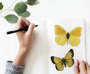
Nothing is ever only one colour
Consider the colour of a Golden Retriever and you might be tempted to grab the cream or yellow paint and have a go at it. Study it and you will notice the golden collar is shot through with almost-white highlights and deep ochre shadows. The trick is to pick a few colours in the range and work on creating depth of colour that is life-like. Most phones or computers will have a function to increase saturation and this is a useful tool to learn how to see different colours in an image – just remember to go back to the original reference or you might have a very psychedelic lion on your easel!
Build up your colour in layers
Depending on the medium you will work either from light to dark or shadow to highlights, but in building up your colour you create depth. Even though we are spoiled for choice with sets of pencils or paints boasting all the colours one can realistically fathom, you will find that subtle layering creates a realistic depth and tone variation that sets your image apart. Even black is often a pigment hardly ever used on its own – layering a red, blue or brown over or under black gives it a whole new dimension.
Get your colour values right
This, to me, is the hardest part: making sure your shadows and highlights are correct. For a new artist its often difficult to judge whether the shadow they are laying down is too dark or not dark enough and the same go for highlights. It is often easier to get to a point where your image is largely finished and then go back and add more shadows and highlights as necessary. Try converting your image into monotone to judge how light or dark it should be. Shadow and light is the essential ingredient to a three dimensional drawing and plays an integral part in creating the contours of a body. It is also very important to know your medium as some mediums like watercolour and coloured pencils are quite unforgiving and will not allow highlights to be added. Without the correct values an image is flat and lifeless and even when your colours aren’t exactly right, getting value right will make your image more realistic.
Be kind to yourself – Rome was not built in a day and quite frankly even with a good reference, you cannot paint Rome realistically in a day. Spend time practicing and focus on small steps and I promise you that the results will come.
Would you like to know more? Let us know your questions on Facebook!
-
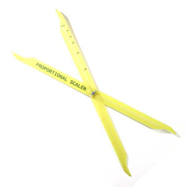
 Proportional ScalerR465.00
 -
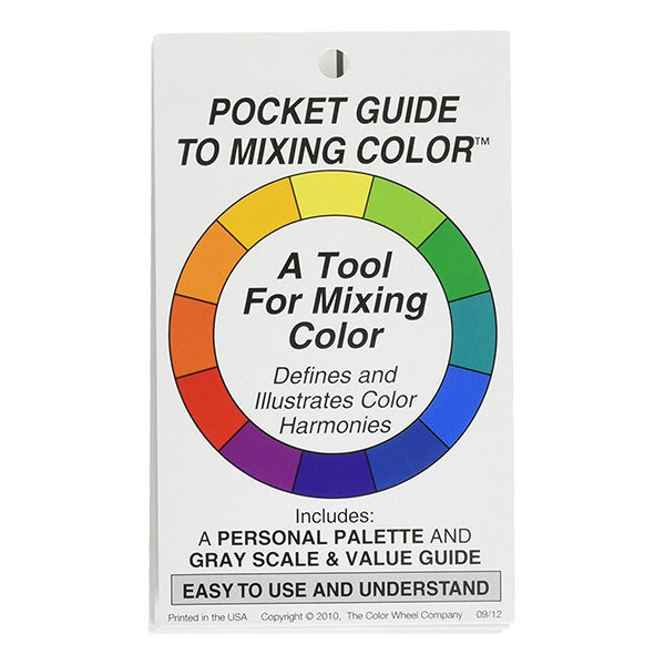
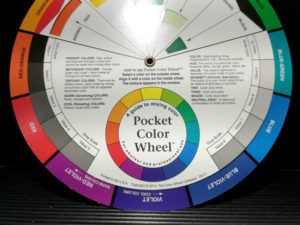
Pocket Guide to Mixing Color – The Color Wheel CompanyR159.00
-
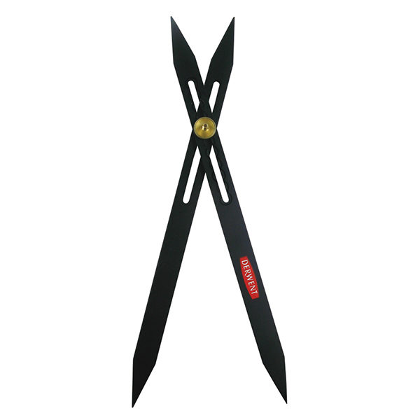
Scale Divider – DerwentR285.00
-
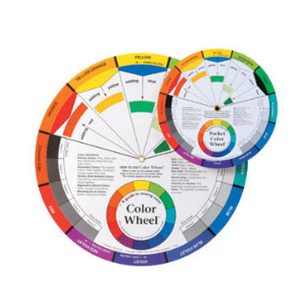
Colour Wheels – Mixing GuideR195.00 – R299.00