


Description
Holbein Artists’ Gouache is an ultra-premium gouache made with exceptionally finely ground pigments, resulting in superior colour performance and a smooth, velvety matte finish. The carefully selected pigments offer intense colour saturation, excellent lightfastness, and outstanding mixing capabilities, allowing colours to blend freely while retaining their brilliance, opacity, and tonal value. Unlike many competing products, Holbein adds no whitening or opacifying agents to increase coverage, ensuring colours remain clean, vibrant, and true. This formulation consistently delivers reliable results without “milking out,” darkening, or becoming muddy when mixed.
With its silky-smooth consistency and high pigment concentration, Holbein Artists’ Gouache achieves remarkable opacity using naturally opaque pigments alone. The colours provide excellent covering power and maintain their clarity and richness over time. Particularly suited to layering techniques, each colour can be applied over another with complete coverage, without cracking, bleeding, or compromising the integrity of underlying layers. As with most matte gouache finishes, the painted surface remains delicate and should be protected from scratching or excessive handling. Applying a fixative or matte varnish can increase surface durability, although it may slightly alter the appearance by increasing transparency. Holbein Artists’ Gouache can also be mixed with Holbein watercolours, acrylic paints, and acrylic inks diluted for airbrush applications, making it a highly versatile medium for illustrators, designers, and fine artists.
Standard Range
The Holbein Artists’ Gouache Standard range is available in 137 brilliant, predominantly opaque colours in 15 ml tubes. Colours are assigned to a series (A, B, C, D, E, and G), which reflects the relative cost and rarity of the pigments used. All colours are professional quality, with the series designation indicating pigment value rather than paint quality. The range carries an overall ASTM Lightfastness Rating of A, with most colours classified as moderately durable (*). Opacity varies by colour; while the majority are opaque, some shades are classified as semi-opaque.
Certain colours contain ox gall, an animal-derived wetting agent traditionally obtained from cattle bile. Ox gall enhances the handling properties of the paint by:
• Improving wetting, allowing water to spread more evenly through the paint.
• Reducing surface tension, enabling smoother flow across the paper surface.
• Improving pigment dispersion, helping pigments remain evenly distributed.
• Enhancing coverage, particularly in opaque, metallic, and heavily pigmented colours.
• Aiding rewetting, allowing dried paint to reactivate more readily with water.
The presence of ox gall primarily affects the paint’s working properties and has little impact on the appearance of the finished artwork.
Sets Available:
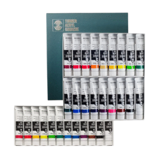
Assorted – Standard range Set of 12.
Colours: Carmine, Flame Red, Permanent Yellow Deep, Lemon Yellow, Permanent Green Deep, Permanent Green Light, Turquoise Blue, Ultramarine Deep, Violet, Burnt Sienna, Ivory Black, and Permanent White.
Yoshiko Yamamoto – Standard range Set of 18.
Colours: Cadmium Red, Cadmium Red Purple, Cadmium Yellow ,Cadmium Yellow Lemon , Yellow Ochre , Terre Verte , Ash Green , Phthalo Green , Cerulean Blue , Cobalt Blue , Ultramarine Deep ,Prussian Blue , Cobalt Violet ,Opera , Burnt Sienna ,Raw Umber , Ivory Black and Zinc White.
Assorted – Standard range Set of 24.
Colours: Alizarin Crimson, Blue Violet, Brilliant Orange, Burnt Sienna, Burnt Umber, Carmine, Emerald Green, Flame Red, Leaf Green, Lemon Yellow, Magenta, Olive Green, Permanent Green Deep, Permanent Yellow, Permanent Yellow Orange, Prussian Blue, Pure Blue, Rose, Turquoise Blue, Ultramarine Deep, Violet, Yellow Ochre, Ivory Black, and Permanent White.
Assorted – Standard range Set of 84.
Colours: Alizarin Crimson, Carmine, Pure Red, Flame Red, Brilliant Pink, Geramium, Cadmium Red Purple, Cadmium Red Deep, Cadmium Red, Brilliant Orange, Cadmium Yellow Orange, Permanent Yellow Orange, Permanent Yellow Deep, Cadmium Yellow, Permanent Yellow, Cadmium Yellow Lemon, Lemon Yellow, Marigold, Naples Yellow, Naples Yellow Italian, Jaune Brillant #1, Jaune Brillant #2, Moss Green, Olive Green, Terre Verte, Viridian, Cyprus Green, Dark Green, Cadmium Green Deep, Cadmium Green, Cadmium Green Pale, Leaf Green, Permanent Green Deep, Permanent Green Light, Emerald Green, Ash Green, Turquoise Green, Cobalt Green Pale, Ice Blue, Cobalt Turquoise, Turquoise Blue, Peacock Blue, Cerulean Blue, Ash Blue, Aqua Blue, Smalt Blue, Pure Blue, Cobalt Blue, Ultramarine Light, Ultramarine Deep, Katsura Blue, Navy Blue, Prussian Blue, Blue Violet, Iris, Violet, Magenta, Rose, Opera, Pink, Rose Violet, Cobalt Violet, Lilac, Yellow Ochre, Raw Sienna, Raw Umber, Burnt Sienna, Burnt Umber, Chinese Orange, Sepia, Ivory Black, Jet Black, Grey #3, Grey #2, Grey #1, Zinc White, Permanent White, Pearl White, Silver, Brilliant Silver, Pearl Gold, Rich Gold, Brilliant Gold, Pearl Copper, Primary Magenta, Primary Yellow, Primary Cyan, Primary Black, and Primary White.
Irodori Range.
Unlike the standard Holbein Artists’ Gouache line, which was developed as a comprehensive professional mixing system emphasizing saturation, opacity, and predictable colour mixing, the Irodori range was conceived as a collection of 48 traditional Japanese colours inspired by the seasons, historical pigments, textiles, woodblock prints, and the natural world.
The Irodori range is particularly noteworthy because many of its colours behave differently from those in the standard Artists’ Gouache range, especially with regard to transparency and their connection to traditional Japanese colour aesthetics. These differences arise less from the binder or manufacturing process and more from the selection of pigments, the underlying colour philosophy, and the artistic goals of the range. Rather than following the more standardized Western artist-palette approach, the colours embody traditional Japanese concepts of subtlety, seasonal atmosphere, and nuanced colour relationships.
Holbein’s standard Artists’ Gouache is renowned for its strong opacity and reliable covering power, achieved through high pigment concentration rather than the addition of whitening agents. Consequently, the transparency of each colour remains largely dependent on the inherent characteristics of the pigments used.
The Irodori range is deeply rooted in traditional Japanese colour culture, which values muted chroma, greyed undertones, atmospheric colour shifts, seasonal associations, and layered visual effects. To achieve these qualities, many colours are formulated with pigments that are naturally semi-transparent, delicate in tinting strength, and well suited to creating subtle, atmospheric passages. Historically, many of these hues are associated with dye-based colour traditions rather than the opaque mineral pigments more commonly associated with Western painting.
These characteristics make the Irodori colours particularly appealing to artists seeking the visual language of Japanese painting, woodblock prints, and contemporary illustration influenced by those traditions.
View the Holbein page on Woodblock printing with Irodori Gouache paint.
Holbein also promotes Irodori for mokuhanga (Japanese woodblock printing). The colours are formulated to perform well on washi paper and can be mixed with starch paste in the traditional manner used in Japanese printmaking. This connection is significant because traditional Japanese print colours often rely on transparent layering, colour gradation (bokashi), luminosity created through the paper rather than heavy opacity, and delicate interactions between adjacent colours.
As a result, some Irodori colours behave in ways that are highly advantageous for printmaking but less typical of what Western artists expect from gouache. Whereas the standard Holbein Artists’ Gouache range is designed to provide a high degree of consistency across colours, Irodori allows each colour to retain more of its individual pigment character.
Perhaps the most compelling aspect of the Irodori range is that it challenges the common assumption that gouache should always be uniformly opaque. While it shares the same professional-quality Holbein gouache foundation, many colours preserve the natural characteristics of their pigments, resulting in greater variation in transparency, luminosity, and layering behaviour. This variability aligns closely with traditional Japanese colour aesthetics, where subtle seasonal nuances, atmospheric effects, and delicate colour relationships are often valued more highly than absolute covering power.
Sets Available:
Spring – Irodori Starter set of 12.
Colours: Vermilion, Pale Coral, Kerria Japonica Yellow, Lemon, Light Ochre, Pale Patina, Seedling, Myosotis Blue, Dayflower Blue, Bellflower, Silver, Antique Silver.
Summer – Irodori Starter set of 12.
Colours: Scarlet, Orange Yellow, Canola Yellow, Taisha Brown, Spring Green, Evergreen, Bamboo Green, Ultramarine, Oriental Blue, Edo Violet, Black, White.
Autumn – Irodori Starter set of 12.
Colours: Safflower Red, Orange, Gardenia Yellow, Amur Cork Yellow, Amber, Bark Brown, Smoked Bamboo, Leek Green, Pine Tree Green, Elm Green, Indigo, Antique Rich Gold.
Winter – Irodori Starter set of 12.
Colours: Crimson, Iron Oxide, Russet Brown, Dark Brown, Patina, Russet Green, Geisha Blue, Hummingbird Blue, Peony, Rikyu Grey, Blue Black, Antique Gold.



Reviews
There are no reviews yet.