SA Artist Magazine: Issue 28 – Page 30 – 32
Words and photos: Willie Jacobs
DEMONSTRATION – Testing the tools of the trade: Ink and Watercolours
Well-known artist and teacher, Willie Jacobs, is back with a new series! He will be testing a range of art products from watercolour and inks to oils and pastels. Follow him as he discovers new tools and techniques.
Art Savings Club is an online store which offers amazing discounts on a large range of products. I decided to put them to the test and ordered a selection of watercolour and ink media. The online ordering process was simple and the products arrived at my door within 24 hours, which I thought was excellent service. Some of these products were new to me, so I was interested to see what I could do with them… and they didn’t disappoint!
Materials:
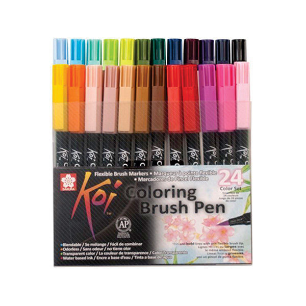
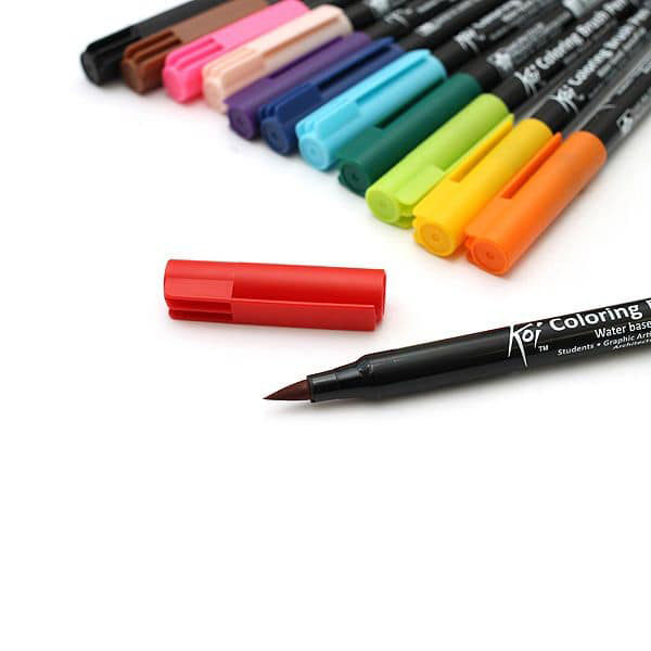
A4 Prime Art Multi-Media Pad – 300gsm, Prime Art Water Brush, Koi Portable Watercolour Set, Koi Colouring Brush: a set of 3 greys, Koi Colouring Brush Set: full-colour range, Micron Archival Ink Pen and Dynasty Watercolour Brushes 12 & 5/0
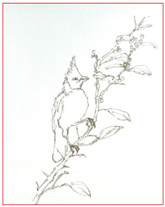
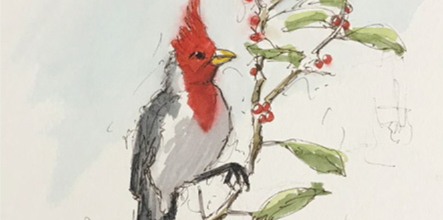
This sketch was done with the Micron Archival Ink Pen. I made sure not to put down curved lines, but rather a series of straight choppy lines. The roundness of the bird’s breast is only a suggestion of roundness. The branch is even more choppy and I exaggerated its negative curve to create more character. The leaves and berries were sketched in very loosely.
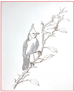
Using the Light Grey Koi Colouring Brush, I covered the shadow side of the bird as well as the branch. This instantly gave the branch the impression that it was three dimensional and just about complete.
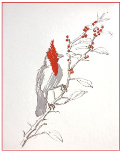
My next step was to bring in some colour. I found the perfect bright red in the Koi Colouring Brush Set. As this product is water-soluble, I applied the colour quite loosely on the bird and the berries: covering the berries only on the shadow side and leaving a bit of white to imply a highlight.
Next, I used the Portable Koi Watercolour Set to paint a very light Cerulean Blue into the background. I then realised that it would be wiser to wash in the background first as the red from the berries started to bleed into the blue when they touched – but I reminded myself that the purpose of the watercolour is only to support the sketch and that this was not a proper watercolour painting.
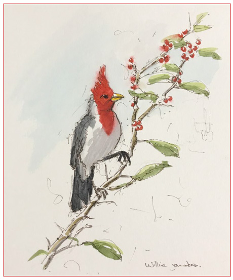
The leaves were loosely brushed in two tones of green, trying to keep a ‘sketchy’ look by not keeping within the lines. I used a mix of Black and a touch of Burned Umber for the dark areas on the bird. Looking back at the sketch, I kind of like the effect of the red bleeding a bit.
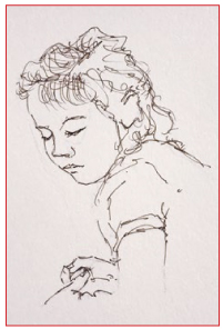
I started the process by doing a very loose scribbly drawing with the Micron Archival Ink Pen. The archival ink is a dark brownish which gives it an ‘old’ feel. At this stage, the purpose of the project is mainly to focus on the sketch and not so much the wash. The sketch needs to look sketchy. The purpose of the wash is to enrich the sketch, but not to overpower it or to take the vibrancy from it.
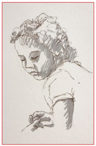
Next, I took the Light Grey Colouring Brush and started to bring in some shading. While doing this I kept in mind that the brush is water-soluble and the rough marks would soften when I applied water. I purposely made rough brush marks to match the looseness of the drawing.
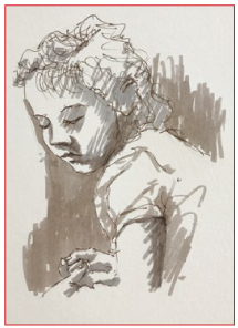
Now it was time for a thin wash. Using a very wet brush I covered a large area of the background with almost clear water. I then brushed a mixture of Black with a touch of Burnt Umber into this wet area.
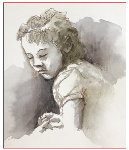
The archival ink created a purplish colour in the darkest areas, which created depth against the warmer colour of the hair. I touched the face very lightly with pure water to soften the edges of the light colouring brush, but making sure to retain the sketchy feel.
Finally, I returned with the Micron Archival Ink Pen to restate some drawing lines and to further restore the sketchy feel of the picture.
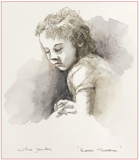
I feel I was fairly successful in capturing this “Sleeping Beauty” as she fell asleep on the couch during a family gathering. I managed to keep the edges open so as not to isolate her from the couch. I kept the hands relaxed and very understated as not to distract, but rather to enhance the peaceful look on her face. In future, I would like to use a bit less of the wash and show a bit more of the pen.
-
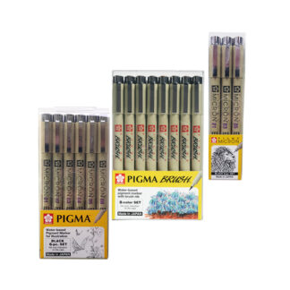
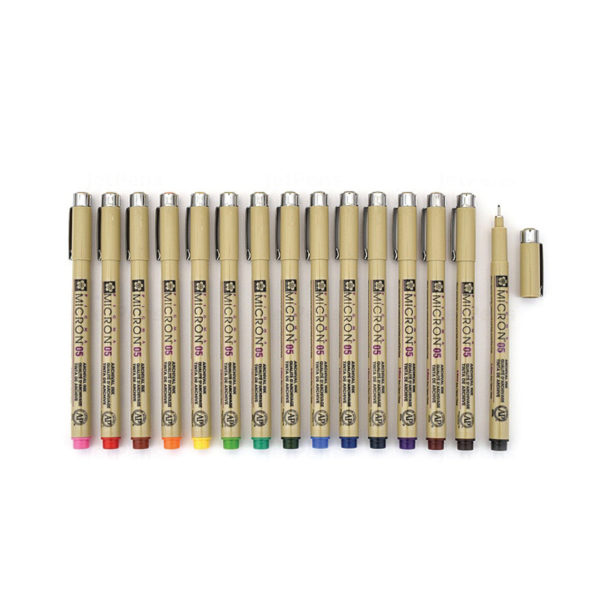
 Pigma Micron Pen Sets – SakuraR125.00 – R375.00
 -
Pigma Micron & Brush Pens – SakuraR39.00 – R49.00
-
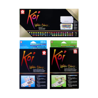
Product on saleKoi Colouring Brush Pen Sets – SakuraR215.00 – R1 525.00
-
Koi Colouring Brush Pens Singles – SakuraR39.00
-
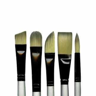
Dynasty Series 4900 Silver Black Brushes – Prime ArtR49.00 – R219.00
-
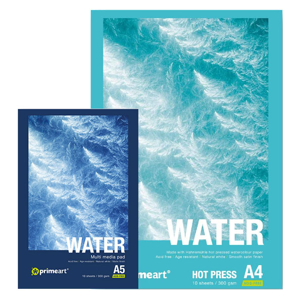
Product on saleWater Pads – Prime ArtR55.00 – R315.00
-
Product on saleKoi Water Colors Paint Pan Sets – SakuraR385.00 – R1 750.00