SA Artist Magazine: Issue 30 – Page 41 – 45
Words and photos: Willie Jacobs
DEMONSTRATION – Testing the tools of the trade: Painting with Oils
Well-known artist and teacher, WILLIE JACOBS, is back with a new series! He will be testing a range of art products from watercolours and inks to oils and pastels. Follow him as he discovers new tools and techniques.
“I love the consistency of Lukas Oil Paints. They don’t dry out on the palette and you can easily mix four colours without creating mud.”
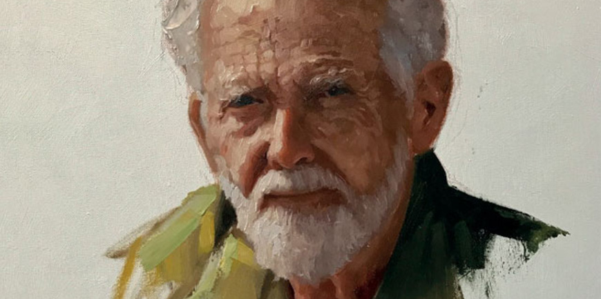
This step-by-step demonstration is of Edwin du Toit, who recently passed away at the age of 87. He and Marie were married for 60 years; raised 6 children and were blessed with 17 grandchildren and 5 great-grandchildren. In this painting, I tried to capture his gentle face and calm demeanour.
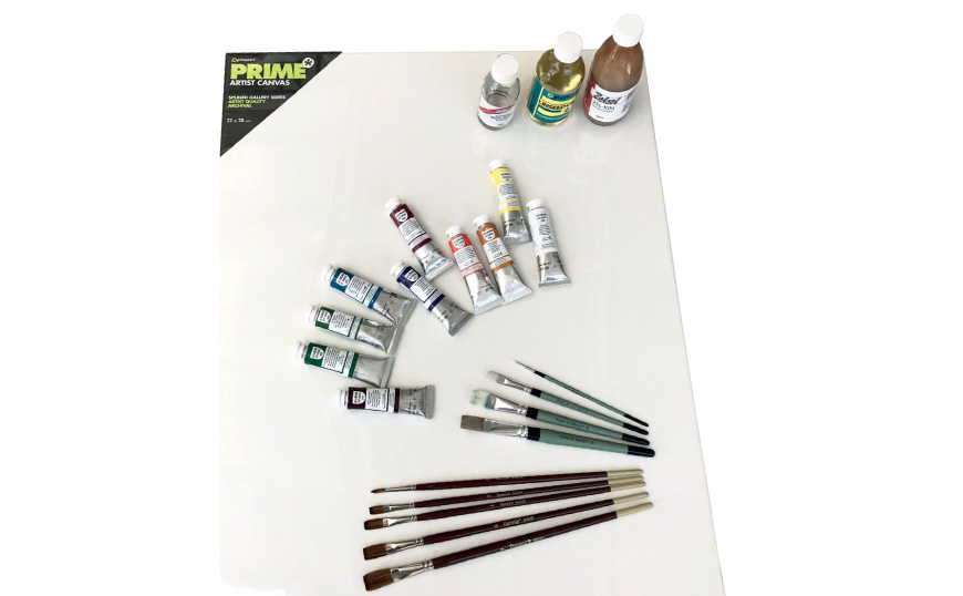
Materials:
PRIME ART Canvas (22 x 28 inch), LUKAS OIL PAINTS: Cadmium Red Light, Yellow Ochre, Ultramarine Blue, Titanium White, Burnt Umber, Cadmium Yellow Light, Alizarin Crimson, Cerulean Blue, Viridian Green & Sap Green, DYNASTY BRUSHES: # 2 round, # 2,4,6,8 Long Flats, PRIME ART BIANCO: # 00 Round, # 10, 16, 20 Brights, ZELLEN Artists White Spirit, ZELLEN Zel-kin painting gel, PRIME ART Linseed Oil.
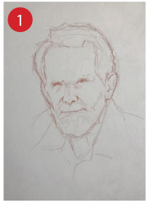
Fig 1:
The sketch on the canvas was done freehand with a terracotta pastel pencil, which erases quite easily. The placement is of utmost importance. I usually hold my hand flat on the canvas in the area I envision the face to be. My thumb represents the chin and my middle finger represent the hairline. This is a life-size measurement for an adult. It gives me a good idea where the eyes should be placed. I make a mark at my thumb for the chin and a mark just above my middle finger for the hairline. Then I add a little extra for the top of the head.
The eyeline is halfway between the top of the head and where I imagine the chin to be. The eyeline gives the position of the brow. Halfway between the brow and the chin is the bottom of the nose:
normally the same distance as the forehead between the brows and the hairline.
The mouth is halfway between the bottom of the nose and the chin. The first mark represents the bottom lip, with the mouth opening just a lip width above it. As a rough guide, the ears usually line up with the brows at the top and the nose at the bottom. I keep my sketch rough and the lines choppy, which gives a “true to life” feeling.
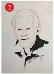
Fig 2:
I always start with my darkest darks first. If you lose your darks you lose your painting. The eyelashes are painted with pure Burnt Umber and the irises with a mixture of Burnt Umber and Ultramarine Blue. The nostrils and the mouth opening with Burnt Umber and Cad Red Light. The deep shadows in the neck are a mixture of Burnt Umber and Cad Red Light and the clothing in the shadow a mixture of Burnt Umber and Ultramarine Blue.
Note that the only place on the face where I use Burnt Umber and Blue is where the irises are going to be painted later, no matter the colour of the eyes. The combination of Burnt Umber and blue serves well to seal the canvas so that the white does not shine through. Eyes need to be solid.
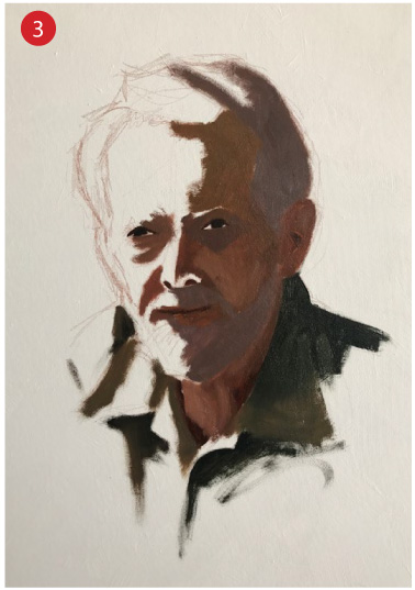
Fig 3:
When all the darkest accents are in place, I make a skintone mixture with Cadmium Red Light, Yellow Ochre and Ultramarine Blue. To make sure this mixture is slightly lighter than my darkest darks, I add a hint of Titanium White. This mixture is one of the most importrant mixtures on the face. I call it “Slightly Lighter” because it is meant to be slightly lighter than my darkest darks. My experience is that this “slightly lighter” mixture puts all my creative abilities in motion to judge lights and darks.
The temperature of this mixture is very important. By mixing a bit more red and blue in relation to yellow ochre, the mixture is more purplish and is ideal for the hollows of the eyes and the shadow on the lip under the nose. By mixing a little extra red in relation to the yellow and blue it is ideal for the bottom of the nose.
The “slightly lighter” mixture can be pushed warmer and cooler, more intense or less intense as the need directs. The foundation for the hair and beard was already put in place with the “slightly lighter” mixture and a little extra Burnt Umber and Ultramarine Blue (Burnt Umber and Ultramarine Blue mixes a very handy Black) for a more greyish feel.
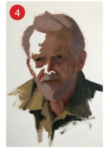
Fig 4:
Next, I paint in the halftones. The halftone value is quite easy to mix: By mixing Cadmium Red Light and Yellow Ochre you will end up with a beautiful fleshy orange in a halftone value. The value is perfect but too warm and intense to be used, so you need to add Ultramarine Blue to the mixture. The blue will pull the value down towards the darks.
By mixing Ultramarine Blue with white you have a “Lightened Blue” in a midtone value to add to the red and yellow mixture. So, the recipe for halftone flesh is Red, Yellow and Lightened Blue (Cadmium Red Light, Yellow Ochre, Ultramarine Blue and Titanium White).
On the forehead, I add a little extra Cad Yellow Light. In the cheek area, I add a little extra Cad Red Light and Alizarin Crimson. In the chin area, I keep the mixture to the cool side: a blue-ish green-ish mixture.
To the shirt, I add extra Cad Yellow Light, Yellow Ochre and a hint of Cad Red Light. The hair and beard are greyed down with Burnt Umber and Ultramarine Blue.
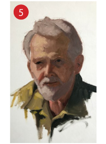
Fig 5:
For the lights I mix the same as Halftones, but with a lot of white. I try to lighten the forehead as light as possible. The secret is in the amount of paint I use. I usually keep the darks and halftones quite thin and make the lights quite thick. By adding Zel-kin to the thicker mixture, it speeds up drying so that I can work into it shortly and do not have to wait days for drying. When I need to thin the paint for darker areas I mainly use the 50/50 mixture of Linseed Oil and White Spirit because I do not want darks that are glossy.
When I add the thicker paint in the light areas, I add enough to work back into the darker areas, as shown in Step 7. This simulates the flow of light over the face.
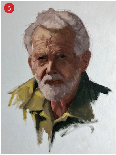
Fig 6:
Just before I restate the darks and add some detail in the dark areas I work the lights back towards the darks with short brush movements, knowing that the colour on the brush will gradually darken as I proceed.
You must clean your brush properly before you go back into the lights again.
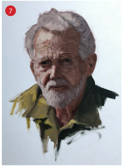
Fig 7:
Now I go back into the darks and restate the dark value where it might have become lighter. I also correct the shape of the eyes, the nose and the mouth. I push back the darkest accents with Burnt Umber and Ultramarine Blue where it is cold and Burnt Umber and Red where it is warm. I use Burnt Umber and Viridian Green for the darkest darks of the shirt.
Again using short strokes to “walk” the halftones as creases into the lights. This is a process of “walking” the darks towards the lights and then “walking” the lights back around the darks for variations of light and dark in the face, in both light and dark areas.
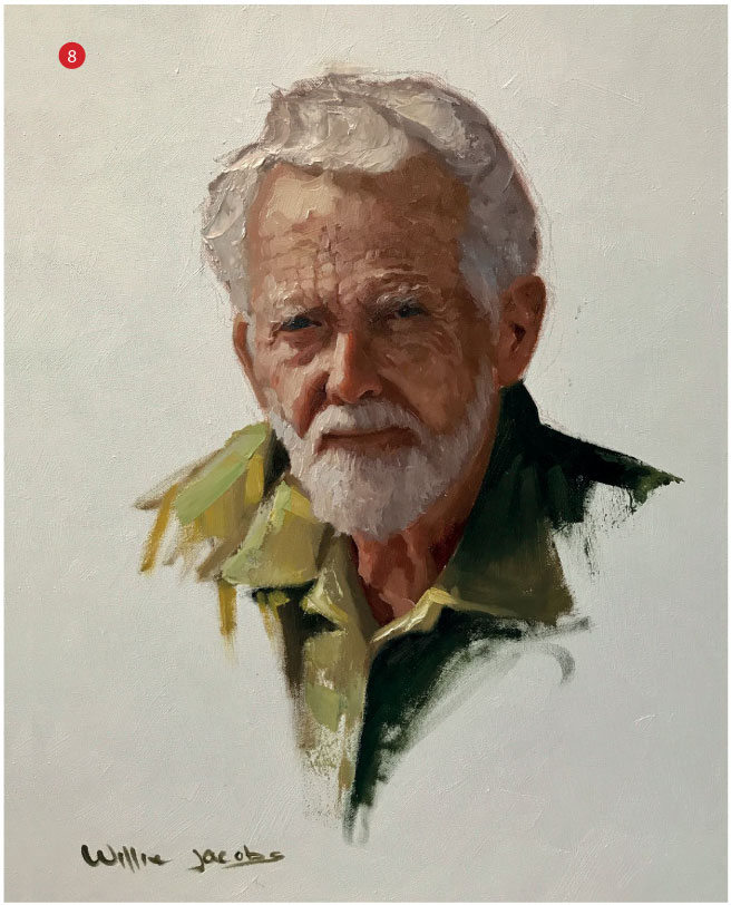
Fig 8:
Finally I use my palette knife to add the lightest lights on the forehead, beard and hair. With the palette knife, I always use off-white mixtures – I never use pure white except when the paint underneath is wet and the white will mix into it.
I decide not to add a background because I think the pure white canvas compliments the painting.
I found the products provided by Art Savings Club to be perfect for this portrait. The Prime Art canvas served as an excellent support under my brushstrokes and palette knife work. I find Lukas paints to be trustworthy and I love the consistency they provide.
Dynasty brushes have been a favourite for years and I find the synthetic range to be a pleasure to work with.
-
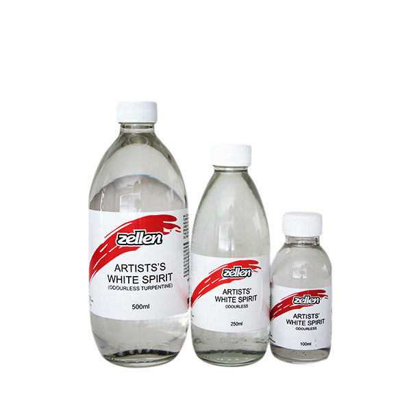
 Artists’ White Spirits – ZellenR55.00 – R185.00
 -
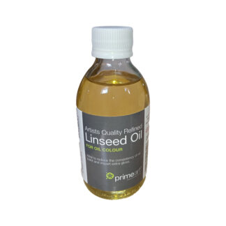
Refined Linseed Oil 200ml – Prime ArtR79.00
-
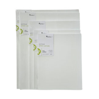
Green Label Gallery Stretch Canvas – Prime ArtR115.00 – R855.00
-
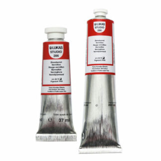
Product on saleStudio Oil Paint Tubes – LukasR85.00 – R375.00
-
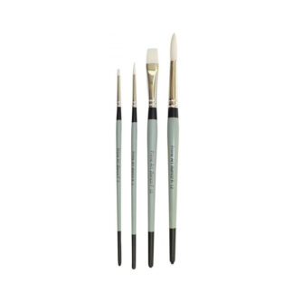
Bianco Brushes | White Synthetic Hair – Prime ArtR16.00 – R72.00
-
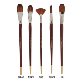
Dynasty Series 8300 Brushes – Prime ArtR65.00 – R229.00
-
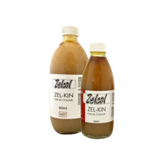
Zel-kin Fast-Drying Medium- ZellenR219.00 – R399.00